Logotype
The logotype on a white background.

The logotype on a burgundy background.

The logo in a black-and-white monochrome version. Use in cases of technical limitations (on monochrome materials, if required by design, or if the logo needs to be placed among many other logos and all are in a single color).


Expanded Logotype
The extended version of the logotype on a white background.

The extended version of the logotype on a burgundy background.

The extended version of the logotype in black-and-white monochrome. Use in cases of technical limitations (on monochrome materials, if required by design, or if the logotype needs to be placed among many other logotypes and all are in a single color).


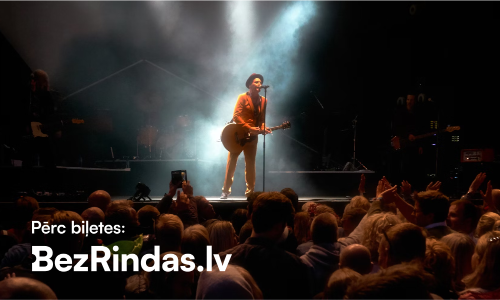
The extended version of the logotype with the text “Buy tickets:” can be used as an alternative. If a different font is required for the text “Buy tickets:”, its size proportion relative to the logotype must be maintained. The text must not dominate over the logotype.
This version of the logotype can also be used on a dark background and in a black-and-white monochrome version.
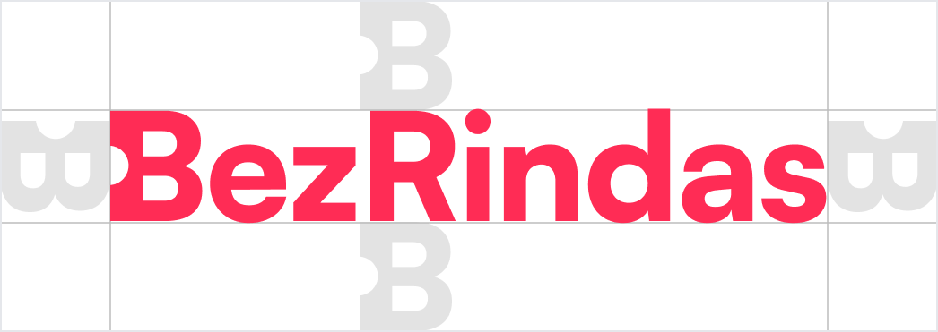
Safety zone, colours
Ensure that no text, other logotypes, or elements that are not part of the background are within the logotype's safe zone.
Logotype colors


Examples of use
Always ensure there is sufficient contrast between the logotype and
the background color or image.
Choose a version of the logotype that is clearly legible and does
not blend into the background.
The full-color primary version of the logotype, which complies with the logotype's safe zone area, is used on a light background.
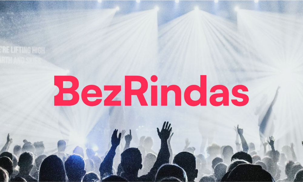
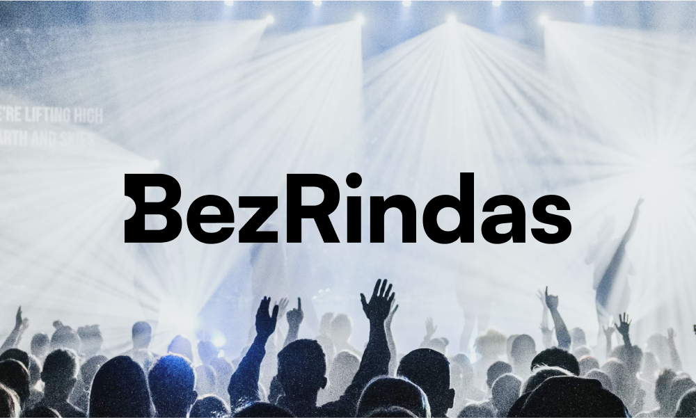
On a dark background, the full-color version of the logotype or the black-and-white monochrome version is used.
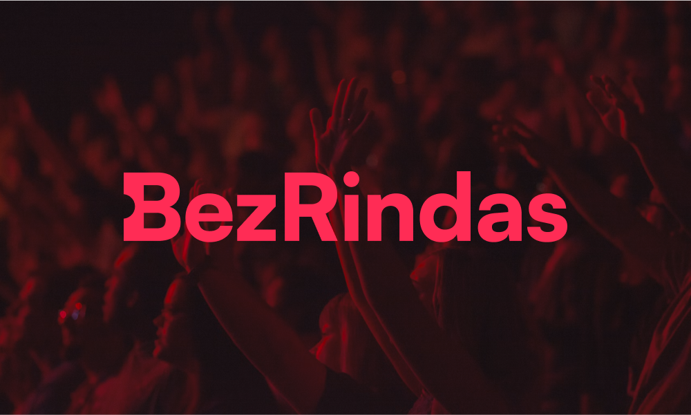
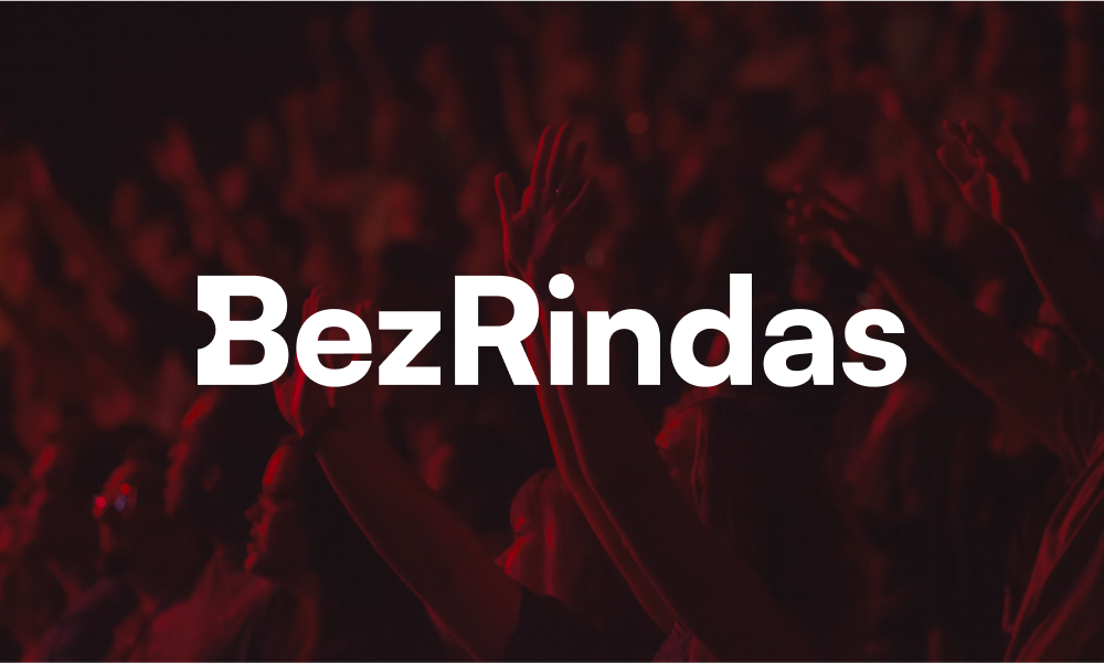
On highly colorful and/or high-contrast backgrounds, the primary version of the logotype or the reversed version with a background is used.
Monochrome versions
In cases of technical limitations, the use of the monochrome version
of the logotype is permissible.
In such cases, one of the colors defined in the brand style is used.


In certain cases, changing the color of the logotype to one
different from those defined in the brand style is permissible.
For example, if none of the original color versions of the logotype
fit the design, or if the number of colors is limited due to
material design and/or technological execution constraints.
In such cases, the logotype is always used in a single color and
must contrast with the background.


Logotype positions
The preferred placement of the logotype in materials is the
bottom-left corner. The placement of the logotype can be adjusted if
required by the design or if the size or shape of the material is
limited.
The logotype must always be used at a size that ensures it is
clearly visible and legible. If the logotype is used with the text
“Buy tickets:”, always ensure that it remains legible.



Incorrect usage
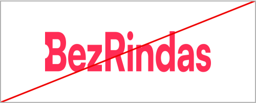
Changing the proportions of the logotype, distorting it, removing elements, rearranging elements, or similar modifications are not permitted.
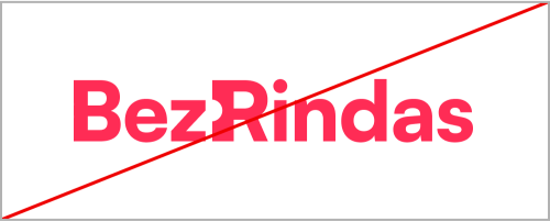
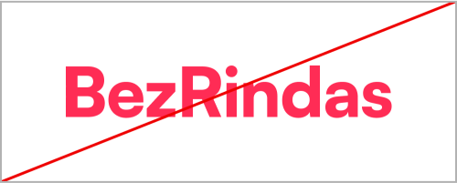
If the primary version of the logotype is used, changing the colors, combining colors, or using other colors is not permitted.
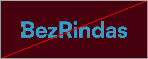
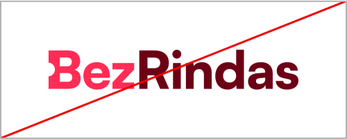
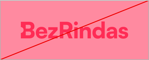
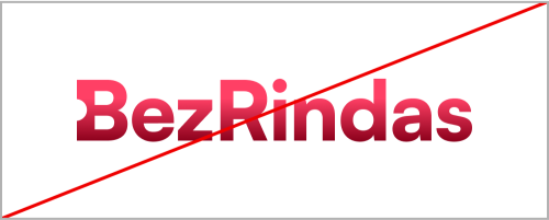
The use of color gradients, outlines, or shadows is not permitted.
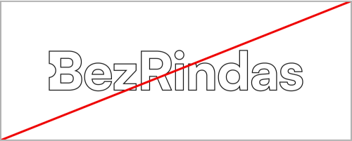
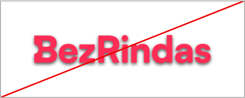
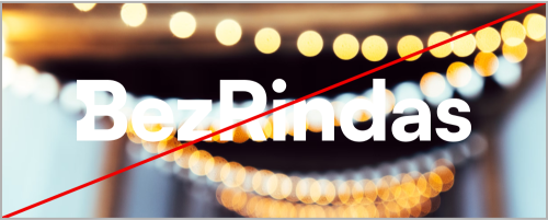
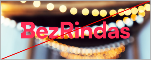
The logotype blending into the background is not permitted.


 LV
LV